Introduction
In the realm of lighting design, achieving accurate colour representation is paramount. The Colour Rendering Index (CRI) is a crucial metric that measures how accurately a light source renders colours compared to natural light. Understanding CRI is essential for architects, interior designers, and lighting professionals striving to create visually appealing and functional spaces. In this comprehensive guide, we’ll delve deep into the concept of CRI, its significance, practical applications, and how it influences our perception of light and colour.
What is CRI?
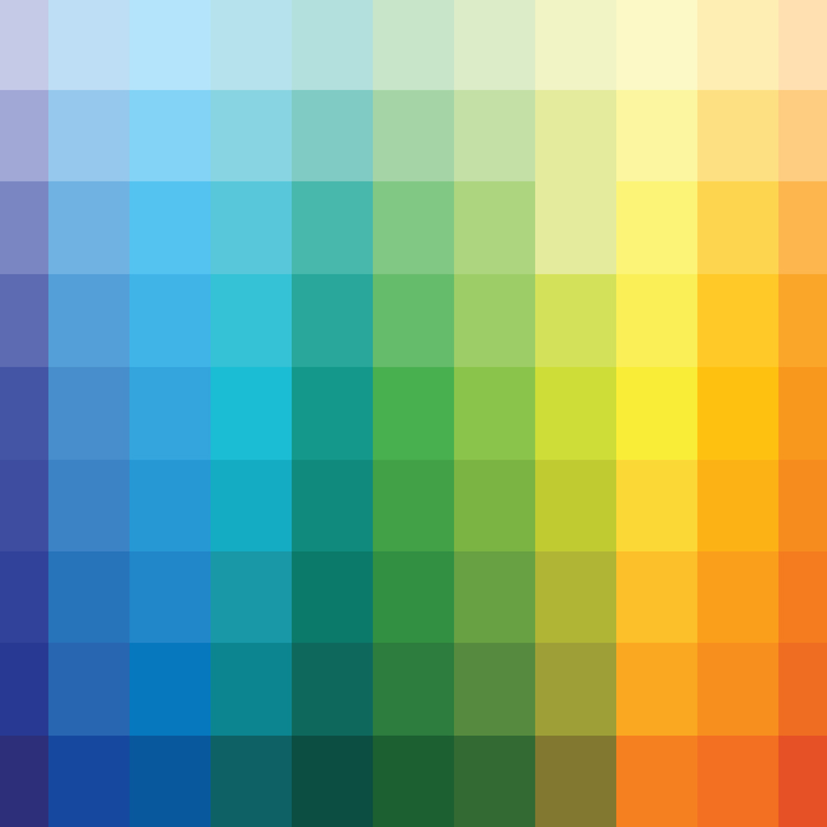
Colour Rendering Index (CRI) is a quantitative measure of a light source’s ability to accurately render colours compared to a reference light source, typically daylight. CRI is measured on a scale from 0 to 100, where higher values indicate better colour rendering. CRI assesses the appearance of eight standard colours under the light source being tested and compares them to their appearance under a reference light source with the same correlated colour temperature (CCT).
The Significance of CRI in Lighting Design
The importance of CRI in lighting design cannot be overstated. Accurate colour rendering is crucial in various applications, including retail environments, art galleries, healthcare facilities, and residential spaces. High CRI lighting ensures that colours appear vibrant, true-to-life, and consistent, enhancing the overall visual experience and allowing occupants to perceive spaces in their full colour richness.
How CRI Influences Colour Perception
CRI plays a significant role in shaping our perception of the world around us. Lighting with a low CRI can distort colours, making them look dull, muted, or significantly different from their true hue. In contrast, high CRI lighting faithfully reproduces colours, allowing us to appreciate the intricate nuances and subtleties of our surroundings. This is particularly important in settings where colour accuracy is critical, such as retail displays, art studios, and design studios.
Practical Applications of CRI
Retail Environments
In retail settings, accurate colour representation is essential for showcasing merchandise in the best possible light. High CRI lighting ensures that products appear true to their colours, helping customers make informed purchasing decisions and enhancing the overall shopping experience.
Art Galleries & Museums
Art galleries and museums rely on precise lighting to showcase artworks in their true colours and textures. High CRI lighting allows visitors to appreciate the artist’s intent and the subtleties of each piece, creating a more immersive and engaging viewing experience.
Healthcare Facilities
In healthcare settings, where accurate colour perception is crucial for diagnostics and patient well-being, high CRI lighting is imperative. Proper lighting can enhance visibility and contrast, reduce eye strain, and create a more comfortable and welcoming environment for both patients and staff.
Residential Spaces
In homes, high CRI lighting can transform living spaces, making colours appear richer and more vibrant. Whether it’s illuminating artwork, enhancing interior décor, or creating a cosy ambiance, lighting with high CRI adds depth and character to residential interiors.
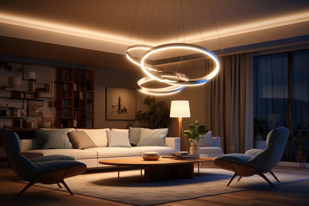


Residential Lighting: In the realm of residential lighting, CCT plays a pivotal role in creating spaces that feel like home. Warm white tones (2700K-3000K) are often favored for living rooms, bedrooms, and dining areas, imparting a sense of intimacy and comfort. In contrast, cooler temperatures may be preferred for task-oriented areas like kitchens or home offices, where clarity and visibility are paramount.
Understanding CRI Ratings
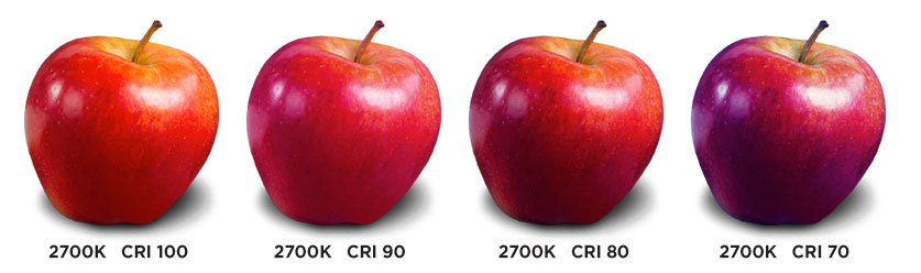
Low CRI (0-60)
Lighting with low CRI may distort colours and render them inaccurately. This can result in poor visual clarity and reduced colour vibrancy, particularly in settings where colour accuracy is critical.
Moderate (60-80)
Lighting with moderate CRI provides better colour rendering compared to low CRI sources but may still exhibit some colour distortion. While suitable for general lighting applications, moderate CRI sources may not be ideal for environments where precise colour accuracy is required.
High CRI (80-95)
Lighting with high CRI offers excellent colour rendering, faithfully reproducing colours with exceptional accuracy and consistency. High CRI sources are ideal for applications where colour fidelity is paramount, such as art studios, retail displays, and design studios.
Ultra-High (95-100)
A CRI rating above 95 is considered ultra-high, with the colour rendering capability of the light source approaching that of the sun. At this level, the light is considered pristine in quality and suitable for all applications.
How is CRI Measured?
CRI is determined by comparing the appearance of standardised colour samples (known as R1 to R8) under the light source being tested to their appearance under a reference light source, typically daylight. The colours are evaluated based on their hue, saturation, and intensity, and the results are used to calculate the CRI value. The higher the CRI value, the closer the light source’s colour rendering is to that of natural daylight.
Advancements in LED Technology & CRI
With the widespread adoption of LED lighting, significant advancements have been made in improving CRI performance. Manufacturers are now producing LEDs with higher CRI values, allowing for more accurate color rendering across a wide range of applications. These advancements have expanded the possibilities for using LED lighting in settings where colour accuracy was previously a concern.
CRI in Lighting Design
As lighting technology continues to evolve, so too will our understanding and appreciation of CRI. Designers and manufacturers will continue to push the boundaries of colour accuracy and fidelity, creating lighting solutions that enhance our visual experience and enrich our daily lives. With CRI as our guiding principle, we can anticipate a future where colours appear more vivid and spaces come alive with exceptional clarity.
Conclusion
Colour Rendering Index (CRI) is a cornerstone of lighting design, shaping our perception of light and colour in myriad ways. From retail displays to art galleries, healthcare facilities to residential interiors, CRI plays a pivotal role in creating environments that are visually captivating, functionally effective, and emotionally engaging. By understanding the significance of CRI and its practical applications, designers can harness the power of light to create experiences that inspire, uplift, and delight.
In the ever-evolving landscape of lighting design, let CRI be our guiding star, illuminating the path towards a future where colours shine true and spaces come alive with brilliance and beauty.
References
- International Commission on Illumination (CIE). “CIE 13.3-1995 Method of Measuring and Specifying Colour Rendering Properties of Light Sources.”
- Illuminating Engineering Society (IES). “IES TM-30-18 Method for Evaluating Light Source Colour Rendition.”
- Energy Star. “Learn About Colour Rendering Index (CRI).”
- Lighting Research Centre. “Colour Rendering Index (CRI).”
- National Electrical Manufacturers Association (NEMA). “Understanding CRI.”